
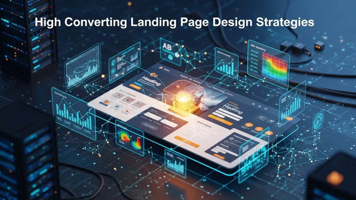
A great landing page reduces friction, builds trust fast, and moves visitors toward one clear action by aligning message, proof, and experience with user intent.
A landing page works best when it feels obvious, reassuring, and easy to act on. People do not arrive on a page hoping to think harder; they arrive hoping to solve a problem, compare a solution, or finish a task with confidence. That is why High Converting Landing Page Design matters so much in modern marketing. The page is not just a design exercise. It is a decision-shaping environment built around clarity, trust, and motivation.
When a visitor reaches a page, the first few seconds determine whether attention grows or disappears. A strong page answers three silent questions immediately: What is this? Is it for me? Why should I trust it? If your page can answer those questions quickly, you lower anxiety and increase momentum. That is the psychology behind High Converting Landing Page Design.
The best pages are not the prettiest pages. They are the clearest pages. They guide the eye, reduce confusion, and make the next step feel safe. That is especially important when your goal is leads, demos, signups, or purchases. In practice, High Converting Landing Page Design combines message clarity, persuasive structure, emotional triggers, and usability discipline.
This guide breaks down the strategy behind pages that convert. You will see how to build trust, frame value, simplify choices, and support the visitor’s decision with evidence. You will also learn how to align the page with intent, improve lead quality, and make the experience work for both people and search engines. In other words, High Converting Landing Page Design is not about decoration. It is about helping the right visitor say yes with less resistance.
Why Landing Pages Convert or Fail
Conversion is rarely random. It usually follows a pattern of mental comfort or mental friction. Visitors convert when they feel understood, safe, and confident. They leave when they feel uncertain, overloaded, or distracted. That is why High Converting Landing Page Design begins with understanding behavior rather than choosing colors.
The role of cognitive ease
People prefer pages that feel simple to process. When copy is direct, visual hierarchy is clean, and the offer is easy to grasp, the brain spends less energy decoding the page. That creates a smoother path to action. A page that feels easy often performs better than one that looks impressive but demands too much effort. Good High Converting Landing Page Design respects the visitor’s limited attention.
Trust before action
No matter how strong the offer is, trust must appear before commitment. Visitors look for cues such as testimonials, logos, guarantees, privacy signals, and consistency in language. These cues reduce perceived risk. The more important or expensive the offer, the more proof the page needs. Strong High Converting Landing Page Design uses trust elements as part of the decision process, not as decoration.
The cost of distraction
Every extra link, competing CTA, or unnecessary section increases hesitation. A landing page should be purpose-built, not page-built from leftovers. When too many paths exist, the page loses its persuasive force. The visitor starts comparing options instead of moving forward. Effective High Converting Landing Page Design protects the page from internal competition.
Start With Intent, Not Layout
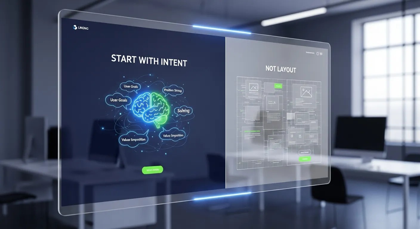
Design should follow intent. That means the page structure must reflect what the visitor already believes, fears, and wants. Someone looking for a demo has a different mindset from someone looking for a checklist or a free template. High Converting Landing Page Design performs best when the message mirrors that intent.
Match the visitor’s stage
A cold visitor usually needs more explanation, more reassurance, and more social proof. A warm visitor needs faster clarity and a stronger reason to act now. A highly informed visitor may want specifics, benchmarks, and comparisons. High Converting Landing Page Design becomes more effective when the page speaks to the right stage of awareness.
Reduce friction in the first scroll
The first screen should create momentum, not curiosity alone. It should state the promise, explain the outcome, and make the primary action visible. The visitor should not have to search for relevance. The goal is to remove ambiguity before it grows. Good High Converting Landing Page Design makes the value unmistakable.
Align message with source traffic
Visitors from search, paid ads, email, or social media each carry different expectations. A message that matches the source feels familiar and credible. A message that feels disconnected creates bounce risk. High Converting Landing Page Design should therefore be adapted to the promise made before the click.
The Psychology of a Converting Page
Great pages do not manipulate people. They reduce uncertainty and support decision-making. Human psychology is central to High Converting Landing Page Design because conversion is an emotional event supported by logic.
Desire for a clear outcome
People respond to outcome-oriented language. They want to know what improvement, relief, or gain will happen after the click. Vague descriptions weaken action. Specific benefits strengthen it. If the visitor can imagine the result, the page becomes more persuasive. High Converting Landing Page Design should always lead with a concrete transformation.
Fear of the wrong choice
A major reason people hesitate is not lack of interest but fear of regret. They wonder whether the product will work, whether the time is worth it, or whether they will look foolish deciding too soon. A page that addresses objections directly lowers that fear. Strong High Converting Landing Page Design answers the unspoken objection before the user asks it.
Social validation and belonging
People trust what others already trust. This is why testimonials, case studies, ratings, and usage statistics matter. They imply that someone similar has already made the decision and benefited. That kind of proof shortens the internal debate. In High Converting Landing Page Design, social validation should feel authentic and specific, not inflated.
Core Elements of a High-Performing Page
A conversion-focused page has a few essential parts. Each part plays a role in guiding attention from interest to action. When these parts work together, High Converting Landing Page Design becomes much stronger.
| Element | Purpose | Psychological effect |
|---|---|---|
| Headline | States the core value | Reduces confusion |
| Subheadline | Adds context and clarity | Builds relevance |
| Hero visual | Shows the outcome or product | Improves comprehension |
| CTA | Defines the next step | Lowers hesitation |
| Proof | Supports trust | Reduces risk |
| Benefits | Connects features to outcomes | Increases desire |
| Form | Collects information | Converts intent |
Headline
The headline is the promise. It should be direct, outcome-driven, and relevant to the visitor’s intent. Clever headlines can be fun, but clarity usually wins. The headline should answer the main question: what does this page help me do? In High Converting Landing Page Design, the headline sets the conversion path.
Subheadline
The subheadline expands the promise without adding complexity. It can clarify who the offer is for, what makes it different, or how it works. A good subheadline adds confidence. It should never repeat the headline mechanically. In High Converting Landing Page Design, the subheadline strengthens the first impression.
Call to action
The CTA should feel specific and low-friction. “Get the guide,” “Book a demo,” and “Start free trial” all communicate different levels of commitment. The wording should match the visitor’s readiness. Better CTAs do not pressure; they guide. High Converting Landing Page Design benefits when the CTA feels like a natural next step.
Message Architecture That Moves People
The page must tell a simple story. First, there is a problem. Then, there is a promise. Next, there is proof. Finally, there is a path forward. That structure is one of the most reliable frameworks in High Converting Landing Page Design.
Problem framing
A strong page begins by naming the pain in the visitor’s own language. When people feel understood, they stay longer. Problem framing should be sharp but not dramatic. It should describe the real friction that the audience already experiences. That makes High Converting Landing Page Design feel personally relevant.
Promise framing
After the problem comes the promise. The promise should describe the result, not just the mechanism. People are motivated by outcomes more than features. A good promise helps the visitor picture a better situation quickly. High Converting Landing Page Design works best when the promise is specific and believable.
Proof framing
Proof bridges the gap between promise and belief. This can include testimonials, statistics, case studies, expert endorsements, or product screenshots. Proof should feel tied to the promise, not floating separately on the page. The more directly it supports the claim, the stronger the High Converting Landing Page Design.
Path framing
The final part is the path. This is where the visitor learns exactly what happens next. Clear forms, visible CTAs, and reassuring microcopy reduce hesitation. People move when the path feels safe and finite. High Converting Landing Page Design should never leave the next step ambiguous.
Visual Design Principles That Support Conversion
Design should help decision-making, not compete with it. Visual choices influence trust, reading flow, and attention. That means every style decision should support High Converting Landing Page Design.
Simplicity over noise
A clean layout is easier to scan. White space helps content breathe and makes key elements stand out. A page packed with too many colors, icons, or boxes feels exhausting. Simplification is not minimalism for its own sake; it is conversion discipline. In this approach, less visual noise usually means more action.
Contrast and hierarchy
Contrast helps visitors know where to look first, second, and third. The highest-value content should receive the most visual emphasis. Headings, buttons, and proof points should be easy to identify. Without hierarchy, every element competes equally, which weakens momentum. Good High Converting Landing Page Design uses hierarchy to reduce effort.
Consistency and familiarity
People feel safer when patterns are familiar. Consistent spacing, button styles, typography, and color usage create a sense of order. Familiarity does not make a page boring; it makes it trustworthy. High Converting Landing Page Design should feel coherent from top to bottom.
Mobile-first thinking
Many visitors arrive from mobile devices. That means tap targets, section length, and form design must work on smaller screens. A page that looks great on desktop but feels cramped on mobile loses conversions. The page must be responsive in both layout and intent.
Copywriting That Converts Without Sounding Pushy

Words do the heavy lifting on a landing page. They must clarify, reassure, and motivate without sounding forced. Strong copy is one of the biggest advantages in High Converting Landing Page Design.
Speak to outcomes
Visitors care less about the tool and more about the result. Instead of listing features in isolation, connect them to business or personal gains. That makes the value easier to feel. The best page translates functionality into outcome language.
Use concrete language
Specific words create trust. Numbers, timeframes, examples, and scenarios all help the reader imagine the offer in real life. Abstract phrases are easy to ignore. Concrete copy feels grounded and useful. In High Converting Landing Page Design, specificity sells because it reduces doubt.
Eliminate friction words
Phrases that imply risk, effort, or pressure can weaken conversion. Overly technical language, vague claims, and aggressive urgency can all create resistance. The goal is not to sound exciting at all costs. The goal is to sound credible and helpful. That is what makes the page persuasive.
Microcopy matters
Small supporting lines near forms and buttons can lower anxiety. For example, a privacy note, a time estimate, or a short reassurance can make action feel easier. Microcopy often carries more emotional weight than people expect. In High Converting Landing Page Design, small details can produce large gains.
Building Trust Fast
Trust is not a single section; it is a repeated signal across the page. Visitors scan for evidence that your page is legitimate, relevant, and worth their attention. That is why High Converting Landing Page Design should be built around confidence cues.
Testimonials that feel real
The most convincing testimonials are specific, relatable, and outcome-based. Generic praise does not move skeptical readers. A useful testimonial explains what changed, for whom, and why it mattered. Strong page design uses testimonials as evidence, not filler.
Case studies and examples
Case studies show the process behind the promise. They help visitors see how results happen in practice. Even a short example can increase belief because it turns an abstract claim into a concrete story. Page design gets stronger when proof is visible and believable.
Logos and recognition
Brand logos, media mentions, and partner badges can reduce uncertainty quickly. They serve as instant social signals. However, they work best when the audience recognizes them and when they are not overused. In High Converting Landing Page Design, credibility should feel earned.
Risk reversal
Guarantees, free trials, cancellation clarity, and no-obligation wording all lower perceived risk. When people know they can back out safely, they become more willing to move forward. Risk reversal can be a major conversion lever in High Converting Landing Page Design.
Offer Design and Value Perception
A page does not convert just because it looks good. The offer itself must feel valuable. Value perception is central to High Converting Landing Page Design because people convert when the exchange feels fair.
Clarify the exchange
The visitor should understand exactly what they get and what they give up. Too much uncertainty weakens action. If the offer is free, explain why it matters. If it is paid, show why the investment is reasonable. The page is stronger when value is transparent.
Stack benefits carefully
Benefit stacking helps visitors see multiple reasons to act. But the list should feel meaningful, not inflated. Each benefit should add a distinct reason, not repeat the same idea. In High Converting Landing Page Design, depth matters more than length.
Make scarcity honest
Urgency and scarcity can work when they are real and relevant. Deadlines, limited seats, or expiring bonuses can prompt action. But fake urgency damages trust. Ethical High Converting Landing Page Design uses real constraints only.
Forms, Friction, and Lead Quality
Forms are where interest becomes a lead. That makes form design a major part of High Converting Landing Page Design. The fewer obstacles you create, the more likely the visitor is to complete the action.
Ask for only what you need
Every field adds effort. If you can capture the same goal with fewer fields, do it. The shorter the form, the lower the drop-off. But do not sacrifice quality blindly. Great High Converting Landing Page Design balances conversion volume with lead quality.
Progressive disclosure
Sometimes the best strategy is to ask for more information later. A first step can be simple, with more detail gathered after trust has formed. This reduces initial resistance while still supporting qualification. High Converting Landing Page Design can improve when information is collected in stages.
Form reassurance
People hesitate when they do not know what happens after submission. Short privacy statements and expectations help. Tell them whether they will receive a response, a guide, a call, or an email sequence. That clarity supports High Converting Landing Page Design and reduces anxiety.
Lead scoring mindset
Not every lead is equally valuable. A page that attracts the wrong people may look successful while producing poor business outcomes. That is why form logic and messaging should filter for genuine interest. Good landing page strategy supports both conversion and qualification.
SEO and Intent Alignment
A landing page can be persuasive and still miss search intent. That is why page design must support discoverability as well as conversion. In modern marketing, High Converting Landing Page Design should work alongside search signals and relevance.
Keywords without stuffing
Natural keyword usage helps the page stay relevant without sounding robotic. Search engines and readers both respond better to meaningful language than to repetition. Semantic variety also helps the page feel human. High Converting Landing Page Design should be visible, but not forced.
Match page language to search intent
A user searching for a guide, comparison, or solution expects a specific type of content. The page must satisfy that expectation quickly. If the page feels misaligned, the visitor leaves. Good High Converting Landing Page Design respects intent from the first line to the final CTA.
Internal coherence
The headline, body copy, CTA, and supporting sections should all point to the same outcome. Mixed messages can weaken both SEO signals and conversion behavior. Coherence makes the page easier to understand and easier to trust. That is why High Converting Landing Page Design should stay tightly aligned throughout.
Advanced Optimization Tactics
Once the basics are strong, optimization becomes a process of refinement. The goal is to learn what improves behavior and what creates friction. That process strengthens High Converting Landing Page Design over time.
A/B testing
Test one meaningful element at a time: headline, CTA, hero visual, proof order, or form length. Small changes can have large effects, but only when they are measured carefully. A/B testing turns opinion into evidence. In High Converting Landing Page Design, data should guide iteration.
Heatmap analysis
Heatmaps reveal how visitors move, where they pause, and where they drop off. This can expose hidden problems in layout or message flow. When used correctly, behavior data helps you improve the page without guessing. High Converting Landing Page Design benefits from observation, not assumptions.
Scroll depth and engagement
Not every visitor reads the whole page, but engagement patterns still matter. If people stop before the proof or the CTA, the page may be losing them earlier than expected. Tracking scroll depth helps locate the weak point. Strong page optimization is built through continuous diagnosis.
Conversion segmentation
Different audiences respond to different proof, offers, and messages. A page may need variants for cold traffic, warm traffic, and returning visitors. Segment-specific messaging often improves results because it feels more personal. High Converting Landing Page Design becomes sharper when the experience is tailored.
The Role of Online Reputation Management
A high-performing page does not exist in isolation. People often check brand reputation before deciding. Reviews, comments, search results, and social proof outside the page influence trust inside the page. That is where Online Reputation Management becomes relevant to High Converting Landing Page Design.
If the wider brand experience is inconsistent, the page has to work harder to overcome skepticism. If the reputation is strong, the page converts more easily because visitors arrive with less fear. That means landing page strategy should connect with brand credibility across channels. In practice, the page performs best when the promise on the page matches the promise in the market.
How to Use Supporting Content for Better Leads
Not every visitor is ready to convert immediately. Some need a softer path before they become a lead. That is where supporting assets increase the effectiveness of High Converting Landing Page Design.
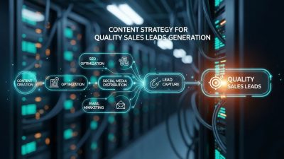
Visitors may respond better when the offer is framed through educational content, comparison pages, short videos, or checklists. These assets warm the audience before the final ask. They also help people self-select into the right funnel stage. When the content path is intentional, High Converting Landing Page Design becomes more efficient.
This is also where Website Lead Capture can be improved without feeling aggressive. The page can introduce the value first, then invite action in a way that feels earned. When people feel they are receiving something useful, they are more open to exchanging their contact details.
Lead nurturing also benefits from pre-offer value. Lead Magnet Ideas like templates, scorecards, audits, or guides can create a safer first interaction. These assets reduce the pressure of a hard conversion and increase the chance of a later, better-quality conversion. Used well, the page turns curiosity into progress.
For B2B, the page should support longer evaluation cycles. The decision may involve multiple stakeholders, more proof, and more reassurance. That is why a B2B Lead Generation Engine depends on clarity, proof, and relevance across several touchpoints rather than one isolated page.
On the operational side, many teams improve pages by pairing them with SaaS Monitoring Tools and SaaS Analytics Tools. These tools help track behavior, spot drop-off points, and validate whether a page is attracting the right traffic and the right leads. When analytics and messaging work together, the page can be refined with real evidence.
A Practical Page Flow That Works
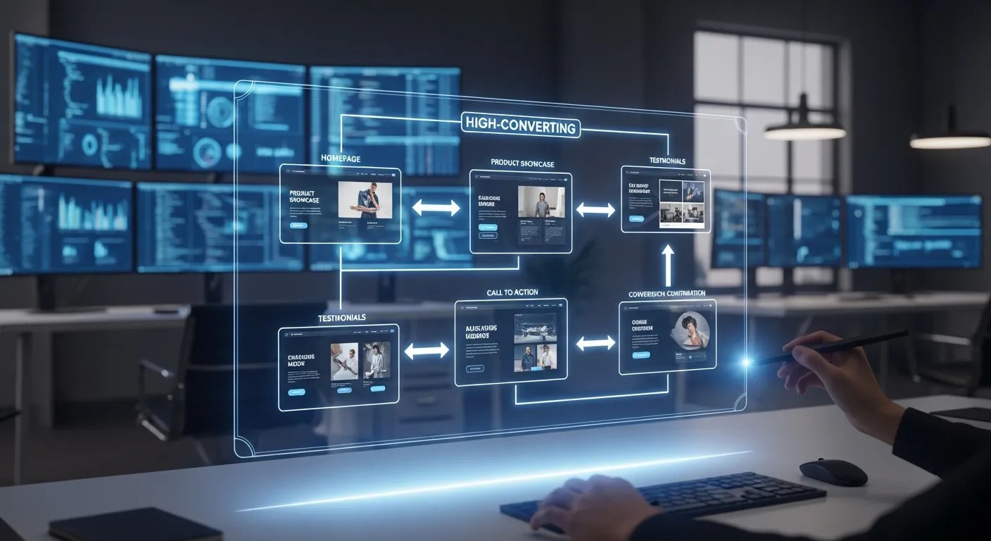
A strong landing page usually follows a predictable flow. It begins with a promise, supports that promise with clarity, then builds confidence and invites action. This flow is not rigid, but it is reliable.
Section 1: Hero
State the value, who it is for, and the main action. The hero should make the page immediately legible.
Section 2: Problem and pain
Show that you understand the visitor’s struggle. This creates emotional alignment.
Section 3: Solution and benefits
Explain what the offer does and why it matters. Make the benefits concrete.
Section 4: Proof
Add testimonials, examples, metrics, or logos. Reduce perceived risk.
Section 5: CTA and reassurance
Invite the action again with a clear button and supporting microcopy.
Section 6: FAQ
Answer objections that might still block conversion.
This sequence is not magic, but it is effective because it mirrors the way people decide. It takes the visitor from uncertainty to clarity and from clarity to action. That is the core of High Converting Landing Page Design.
Common Mistakes to Avoid
Many pages underperform for simple reasons. They are confusing, self-centered, or too demanding. Avoiding these mistakes is often enough to improve results.
Trying to say too much
A landing page is not a brochure. It should focus on one core outcome. Too much information weakens the main message. The page should feel like a guided decision, not a library. High Converting Landing Page Design loses power when it tries to do everything.
Hiding the CTA
If the next step is not obvious, many visitors will stop. The CTA should appear early and again later, depending on the page length. Visibility matters because people should never wonder how to act. High Converting Landing Page Design is strongest when the next step is always clear.
Using generic copy
Generic words make the page feel replaceable. Specificity makes it feel relevant. The visitor should see themselves in the message. That sense of personal recognition is one of the most powerful drivers in page performance.
Ignoring mobile friction
Tiny buttons, large text blocks, and crowded sections can ruin the mobile experience. Since many users browse on phones, this is a major issue. Conversion design must be tested on small screens. High Converting Landing Page Design should never assume desktop-only behavior.
Measuring What Matters
Good pages are judged by outcomes, not opinions. That means you need to measure the right indicators. The purpose of measurement is to improve High Converting Landing Page Design with evidence.
Conversion rate
This is the headline metric, but it should not be the only one. A high conversion rate is not enough if the leads are poor quality.
Bounce rate and exit points
These numbers help you identify whether the page is losing attention too quickly. They can point to message mismatch or weak first impressions.
Form completion rate
This tells you whether the action itself is easy enough. A page can attract clicks but fail at form completion. That would indicate friction in the final step.
Lead quality
The best page is not the one that collects the most contacts. It is the one that collects the right contacts. High Converting Landing Page Design should always be judged against downstream value.
Conclusion
A strong landing page wins because it makes the decision feel safe, clear, and worthwhile. It combines message clarity, visual simplicity, proof, and a friction-light path to action. It also respects psychology by answering unspoken fears before they block movement. When you design for intent instead of decoration, you make the page more useful to the visitor and more profitable for the business. That is the real purpose of this page: helping the right person understand the offer fast, trust it quickly, and act with confidence.
Frequently Asked Questions (FAQ)
What makes a landing page convert better?
A landing page converts better when the message is clear, the proof is believable, the CTA is obvious, and the page removes friction instead of adding it.
How long should a landing page be?
The best length depends on the offer and the audience. Simple offers can use short pages, while complex or high-trust offers usually need longer pages with stronger proof.
Should a landing page have navigation links?
Usually no. Fewer distractions help keep the visitor focused on one action. Removing navigation often improves conversion by reducing exits.
How important is social proof?
Very important. Testimonials, logos, case studies, and reviews reduce uncertainty and make the offer feel safer.
Can one landing page work for every audience?
Not always. Different traffic sources and buyer stages often need different messages, proof, or offers.
What is the biggest mistake in landing page design?
The biggest mistake is unclear messaging. If the visitor cannot instantly understand the offer and the next step, conversion drops.
How do I improve form completion?
Reduce the number of fields, explain why the information is needed, and reassure the visitor about what happens next.
Why do visitors leave quickly?
They may not see relevance, trust, or value quickly enough. Weak headlines, clutter, and mismatched intent are common causes.
Do visuals matter more than copy?
Both matter, but copy usually carries the core persuasion. Visuals support clarity and trust, while copy explains the value.
How often should I test changes?
Test continuously, but one meaningful change at a time. That helps you learn what actually improves results.