


Modern Email Template Design improves readability, consistency, and campaign speed in Marketo by aligning structure, hierarchy, and user psychology with a clear, scalable email system.
Modern Email Template Design is not just about making an email look polished. In Marketo, design affects how quickly a reader understands the message, how reliably the layout renders, and how easily marketers can scale campaigns without rebuilding every asset from scratch.
A good Marketo template reduces friction for the marketing team and for the audience. Marketers need reusable blocks, controlled spacing, and simple editing. Readers need clarity, hierarchy, and a layout that guides the eye toward the main action. When those needs line up, the result is stronger engagement and less production stress.
Modern Email Template Design also supports brand consistency. A single framework can serve newsletters, nurture emails, event invitations, follow-ups, and product updates while keeping the visual system familiar. That familiarity matters because trust grows when every email feels like it comes from the same organized source.
What makes a modern Marketo email template effective
Modern Email Template Design is effective when it balances structure with flexibility. Too much flexibility creates messy emails. Too much structure creates templates that are hard to use. The best version gives marketers enough control to adapt the message while keeping the design system intact.
In practice, effective templates are responsive, modular, lightweight, and easy to personalize. They also anticipate real marketing workflows. A team may need a hero section for announcements, a text-first section for educational content, a CTA block for conversion-focused emails, and a footer that supports compliance. The template should handle all of that without breaking.
Modern Email Template Design works best when it reflects how people actually read. Most readers scan, not study. That means the template must guide attention in a logical order, with strong contrast, readable typography, and clear spacing between sections. Design should reduce effort, not add to it.
Core principles to follow
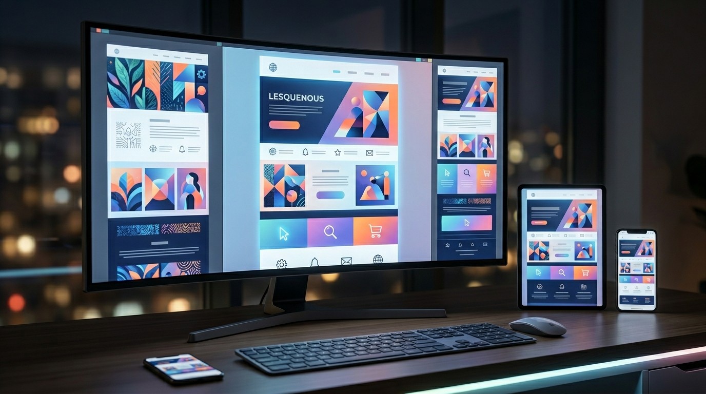
Before building anything in Marketo, it helps to define the principles that will guide the system. Modern Email Template Design should be anchored in readability, consistency, accessibility, and modularity. These principles keep the design useful across different campaigns and audiences.
Readability means text is easy to see and understand. Consistency means buttons, headings, spacing, and image styles behave the same way across templates. Accessibility means color contrast, font sizing, and semantic structure support more readers. Modularity means sections can be moved, duplicated, or removed without damage.
Modern Email Template Design becomes much easier to manage when these principles are treated as guardrails rather than suggestions. Without them, a template can still look attractive in one campaign but fail when reused at scale.
A practical comparison table
| Element | Good practice | Why it matters |
|---|---|---|
| Layout | Single-column or carefully controlled two-column sections | Improves mobile readability and scanning |
| Typography | Clear hierarchy with limited font styles | Reduces cognitive load |
| Spacing | Generous padding and consistent margins | Makes content easier to digest |
| Buttons | One primary CTA style per template family | Creates stronger action focus |
| Images | Optimized, relevant, and not oversized | Speeds loading and keeps attention on the message |
| Modules | Reusable blocks with predictable behavior | Supports scale and easier campaign production |
| Accessibility | Strong contrast and readable type sizes | Broadens usability across audiences |
| Branding | Consistent use of logos, color, and tone | Strengthens recognition and trust |
Building for human psychology
Modern Email Template Design should respect how people think and behave in the inbox. Readers decide very quickly whether something feels relevant, safe, and worth opening. Once inside the email, they look for order, evidence, and a clear next step.
That means the layout should create confidence from the first glance. A cluttered header can create tension. A confusing hierarchy can make the reader give up. A clean structure, on the other hand, lowers resistance and helps the reader continue.
Modern Email Template Design also benefits from the principle of progressive disclosure. Put the most important information first, then support it with details lower down. This mirrors natural scanning behavior and gives the reader control over how much time they spend.
How Marketo shapes the template strategy
Marketo is powerful because it supports scalable automation, reusable assets, dynamic content, and controlled governance. That also means template design needs to be practical, not ornamental. The goal is not to build the fanciest email; the goal is to build one that performs reliably across use cases.
Modern Email Template Design in Marketo should account for asset management, editable sections, brand governance, and rendering consistency across devices and email clients. If the template is hard to update, the workflow slows down. If the template is too loose, brand quality becomes inconsistent.
Marketo teams often manage multiple stakeholders, so the template should make approvals easier. A good framework reduces the chance that every campaign becomes a design negotiation. It gives content, demand gen, and operations teams a shared standard to work from.
Designing the structure
A strong structure usually starts with a header, a hero section, a core message area, supporting content blocks, a CTA section, and a footer. Modern Email Template Design does not require all of these blocks in every email, but it does require a clear system for arranging them.
The header should be minimal and recognizable. The hero section should communicate the main value quickly. The core message area should support the promise with evidence, explanation, or detail. The CTA should be obvious and visually distinct. The footer should contain the legal and preference details without stealing attention.
Modern Email Template Design works better when each section has one job. When a section tries to do too much, the message becomes noisy. The reader should know where to look first, what to understand next, and what action to take at the end.
Typography choices that improve scanning
Typography is one of the most important parts of Modern Email Template Design because it shapes how fast the reader can process the content. In email, clarity beats decoration. A clean sans-serif family with predictable weights often performs better than trendy styling that looks good but reads poorly.
Heading sizes should create a clear visual hierarchy. Body text should stay comfortably readable on mobile without zooming. Line length should be manageable, and line spacing should avoid crowding. If the text feels dense, the reader will subconsciously do more work and may stop reading sooner.
Modern Email Template Design should also avoid using too many type styles. Every extra style adds mental friction. A restrained system usually feels more professional and more trustworthy.
Color and contrast
Color can guide attention, but it should never overpower the message. Modern Email Template Design uses color to organize priority, separate modules, and highlight key actions. It should not use color for decoration alone if that decoration hurts contrast or readability.
Buttons need enough contrast to stand out. Headings need sufficient contrast against their background. Text over images should be used carefully because it can reduce clarity and break in some inboxes. A clean palette often wins because it looks stable and loads reliably.
Modern Email Template Design should also align color usage with brand identity. But brand expression should never come at the cost of readability. If a beautiful palette makes the copy hard to read, it is the wrong palette for email.
Responsive behavior is non-negotiable
Mobile rendering is now a baseline requirement. Modern Email Template Design must adapt gracefully to different screen sizes, inbox apps, and device settings. A layout that looks polished on desktop but collapses on mobile is not a modern template at all.
Single-column layouts often create the cleanest mobile experience. When two-column sections are used, they should stack in a logical order. Buttons should be large enough to tap easily. Images should resize without breaking the flow.
Modern Email Template Design also needs to account for how users scroll. On mobile, the visible area is small, so the hierarchy must be tighter. Important messages should appear early, and the main call to action should not be buried below unnecessary content.
How to keep templates modular
Modularity makes Marketo easier to scale. A modular template allows teams to swap sections without rebuilding the whole email. That speeds production and reduces the chance of design inconsistency.
Modern Email Template Design benefits from reusable content modules such as hero blocks, feature cards, quote sections, CTA bands, and footer elements. Each module should have a clear function and predictable spacing. Marketers should know what happens when a block is added, removed, or duplicated.
The best modular systems are flexible but not chaotic. They support common campaign needs while preventing formatting mistakes. That balance is what turns a template into a practical operating system for email.
Building for different campaign types
A single template family may need to support many use cases. A product announcement might need a bold hero. A nurture email might be text-heavy. A webinar invitation may need stronger visual emphasis. Modern Email Template Design should make each of those modes easy to execute.
Instead of creating a new layout for every campaign, create a stable framework with configurable blocks. That way the team can adapt the content while preserving structure. The audience sees a familiar experience, and the internal team saves time.
Modern Email Template Design also becomes easier to govern when template variations are intentional. Too many one-off designs create drift. A disciplined family of templates keeps branding and workflow aligned.
Relationship between design and subject lines

Writing B2B Email Subject Lines is more effective when the email body and template match the promise made in the inbox. If the subject line suggests urgency, the first section should reinforce that urgency. If it suggests a resource, the template should present that resource without delay.
Modern Email Template Design helps the subject line feel credible after the open. That is important because the first few seconds inside the email either confirm trust or create disappointment. The subject line brought the reader in; the template should reward the click.
When subject line and template are aligned, the message feels coherent. When they are mismatched, the reader may feel misled. In email, coherence is not just a design issue. It is a trust issue.
Where email strategy fits in
A template should support the bigger plan, not replace it. Modern Email Template Design is one part of a broader messaging system that includes segmentation, timing, offer selection, and lifecycle sequencing. If the strategy is weak, even a beautiful template will underperform.
B2B Email Marketing Strategy often depends on reusable assets that can support multiple audience journeys. The template should make it easier to deliver relevant content to the right people at the right time. That means design choices should reflect strategy goals, not simply aesthetic preferences.
Modern Email Template Design becomes more valuable when it fits the stage of the customer journey. A top-of-funnel educational email needs different emphasis than a bottom-of-funnel conversion email. The template should be able to serve both without confusion.
Follow-up experiences that stay coherent
Email Follow-Up Sequences work better when the design language remains familiar. The reader should be able to recognize the sender and the structure even as the message changes. That consistency reduces friction and helps the sequence feel like a thoughtful conversation.
A follow-up should not look like a completely different campaign unless there is a reason. Modern Email Template Design helps sequences feel connected by preserving core spacing, typographic rhythm, button style, and brand cues. That continuity improves recall and trust.
Follow-ups also need a clearer sense of progression. Each touch should add something new, whether that is a reminder, a benefit, a proof point, or a fresh angle. The template can support that progression by making the new element visually obvious.
Technical discipline in Marketo
Marketo templates need careful coding and testing. Modern Email Template Design should be built with the realities of email clients in mind. That means table-based structures where appropriate, cautious use of CSS, fallback-safe typography, and no assumptions about full browser support.
Testing should cover major inboxes, desktop and mobile views, dark mode behavior, and image loading states. A design that works in one environment may fail in another. Marketers often discover that the cleanest-looking design in the editor needs adjustment before it becomes production-ready.
Modern Email Template Design is also easier to maintain when the code is documented well. Clear comments, reusable naming, and a logical file structure help teams avoid accidental breakage. This saves time every time the template is reused.
Accessibility as a performance advantage
Accessibility is often treated as a compliance issue, but it is also a performance issue. Modern Email Template Design that supports more readers usually performs better because it is easier to understand. Good contrast, readable font sizes, and semantic structure all improve the experience.
Alt text should be meaningful where images carry information. Headings should have a logical order. Buttons should be clear and easy to identify. If the content is inaccessible, the design is not complete.
Modern Email Template Design should assume that some readers will use screen readers, low-vision settings, dark mode, or small devices. Designing for those realities usually improves the experience for everyone, not just a small segment.
Common mistakes to avoid
One of the biggest mistakes is overdesigning. Too many boxes, colors, shadows, and images can make a template look busy instead of modern. Simplicity often looks more premium than visual clutter.
Another mistake is inconsistent spacing. If one section has a lot of breathing room and another feels cramped, the email looks unbalanced. Modern Email Template Design depends on rhythm. Rhythm makes the layout feel intentional.
A third mistake is forgetting the CTA hierarchy. If the button blends into the background or if the email has too many competing actions, the reader may leave without acting. Clarity should always beat decoration.
Trust signals inside the layout
Readers are looking for signs that the message is legitimate and worth their attention. Modern Email Template Design can reinforce that with recognizable branding, clear sender identification, a stable layout, and content that feels aligned with the audience.
Trust also grows when the email does not overpromise. The visual style should match the voice of the message. A serious B2B offer should not look like a consumer flash sale. The mismatch creates doubt.
Modern Email Template Design can even influence whether the reader believes the email is worth opening again in the future. A consistent and reliable experience creates memory. Memory creates familiarity. Familiarity increases openness over time.
Avoiding spam triggers through design and copy
Avoid Spam Triggers in Outreach is not only a copywriting task. Design choices can also affect perception. Overuse of promotional graphics, aggressive visual emphasis, or cluttered layout can make an email feel less trustworthy.
The safest approach is to keep the message clean and genuine. Use natural language, balanced visuals, and a clear purpose. If the design feels honest and the copy feels relevant, the email has a better chance of being welcomed.
Modern Email Template Design should never try to disguise intent. Readers appreciate messages that are transparent about who they are, why they are writing, and what the reader gets from opening the email.
Using hierarchy to guide attention
Hierarchy is the invisible structure that tells readers where to look. Modern Email Template Design uses hierarchy to prioritize the most important message first, then supporting details, then the action. Without hierarchy, the reader has to guess.
Hierarchy can be created with size, weight, spacing, color, and placement. The main idea should stand out immediately. Supporting text should feel secondary. The CTA should be easy to find but not louder than the value proposition itself.
Modern Email Template Design becomes more effective when each layer of information is visually distinct. The reader should be able to understand the email quickly, even if they only skim for a few seconds.
Creating a template system, not just a template
The real goal is not one email design. It is a repeatable system that can support many campaigns. Modern Email Template Design should be documented, governed, and adaptable. That is what makes it useful for long-term marketing operations.
A system includes rules for typography, spacing, button style, image usage, module behavior, and approval workflow. It also includes standards for when to use which layout. These rules make the design scalable and less dependent on one person’s memory.
Modern Email Template Design works best when the team can reuse it confidently. If everyone understands the framework, execution becomes faster, more accurate, and more consistent.
How to evaluate performance
A design should be measured by how it helps the email perform. Modern Email Template Design should improve clarity, engagement, click behavior, and production efficiency. It is not enough for the template to look good in a screenshot.
Track metrics that matter for your goals. Open rate alone does not tell the whole story. Click-through, conversion, reply quality, and time to launch are all useful indicators. A template that speeds production and improves engagement has real value.
Modern Email Template Design is successful when it becomes a reliable asset. The best template is one the team can trust campaign after campaign.
A practical design checklist
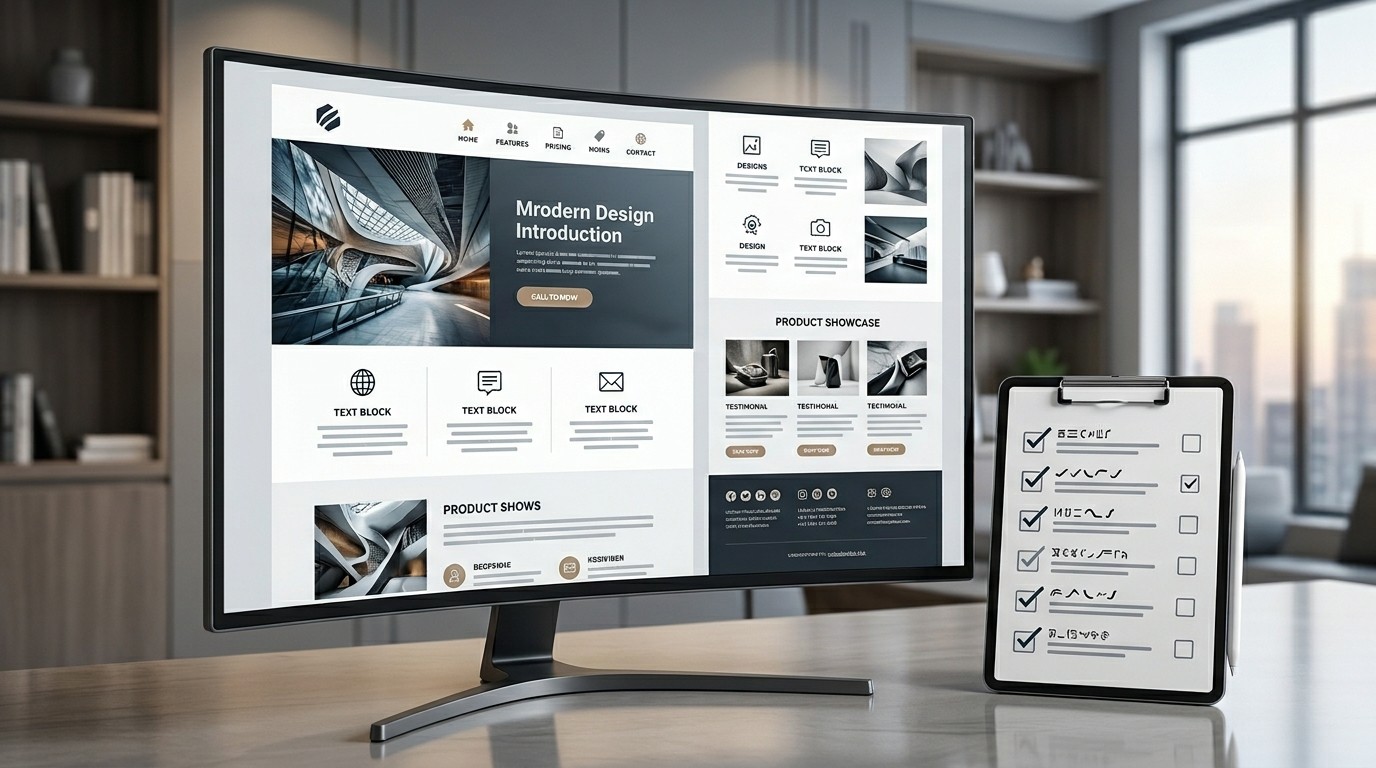
Before launching a new Marketo template, review the core basics. Is the hierarchy clear? Does the layout work on mobile? Is the CTA obvious? Is the spacing consistent? Is the typography readable? Is the code stable? Does the design fit the audience and the offer?
Modern Email Template Design should pass all of those checks before it goes live. A single overlooked issue can weaken the performance of the entire campaign. Careful review saves time, protects the brand, and improves the user experience.
The checklist should be shared across teams so review is consistent. That way everyone is evaluating the same standards, not personal taste. Modern Email Template Design should also be reviewed after launch, because small rendering issues often appear only in live inboxes.
Final strategic perspective
A great Marketo template does more than hold content. It supports a marketing system. Modern Email Template Design should help teams move faster, communicate better, and create more consistent user experiences across every campaign type.
When design is purposeful, the email becomes easier to trust and easier to act on. That is especially important in B2B environments where attention is limited and every impression matters. The better the structure, the lower the friction. The lower the friction, the better the result.
Modern Email Template Design is ultimately about aligning brand, workflow, psychology, and technology into one clean experience. When that alignment is strong, Marketo becomes far more than an automation tool. It becomes a reliable engine for scalable communication.
Conclusion
Modern Email Template Design is one of the most practical ways to improve email performance in Marketo because it connects brand consistency, readability, and campaign efficiency in a single system. A strong template helps readers scan faster, understand messages more easily, and trust the email enough to continue. It also helps marketers produce campaigns with less friction, fewer errors, and more repeatable quality. When the layout is modular, accessible, responsive, and aligned with strategy, the entire email program becomes easier to manage. In a crowded inbox, that discipline creates an advantage. The best templates do not simply look modern; they make every message clearer, safer, and more effective.
Frequently Asked Questions (FAQ)
1. What is the main goal of Modern Email Template Design?
The goal is to create emails that are easy to read, easy to adapt, and consistent across campaigns while supporting higher engagement and smoother production.
2. Why is Marketo a good platform for template systems?
Marketo supports automation, modular assets, and scalable campaign management, which makes it a strong fit for reusable email frameworks.
3. Should Marketo templates be single-column or multi-column?
Single-column layouts usually perform best for readability, especially on mobile, but controlled multi-column sections can work when used carefully.
4. How important is mobile responsiveness?
It is essential. Most readers will see emails on small screens at some point, so the template must render cleanly and remain easy to scan.
5. What typography works best in email?
Clear, readable sans-serif fonts with strong hierarchy and comfortable spacing are usually the safest and most effective choice.
6. How can I keep templates consistent across teams?
Use documented design rules, reusable modules, standard CTA styles, and a shared review checklist so everyone follows the same framework.
7. How does design affect deliverability?
Design affects perception and engagement. Clean, trustworthy emails are more likely to be opened and interacted with, which supports healthy sending behavior.
8. Can one template support many campaign types?
Yes, if it is modular. A well-built system can support announcements, nurture emails, invitations, and follow-ups without needing a full redesign each time.
9. How do I test a new template?
Check rendering across inboxes, devices, and dark mode settings, then review readability, CTA visibility, spacing, and code stability before launch.
10. What is the biggest mistake to avoid?
The biggest mistake is overdesigning. A modern email should feel clear and usable, not crowded or visually distracting.